Mojo • Mobile app
Structure that converts
Enabling users to make the most out of the world’s first AI sex and relationship therapist through constraints.
Key summary
When Mojo became an AI-first product, it gained a coach that could do anything. But research showed that users were struggling with it — they didn't know how to make use of all this potential. Over two major releases, I led an initiative to put structure back in: first into the users’ journey, and then into their conversations. Both additions achieved a 20%+ improvement of trial conversion, the main metric we were optimising for.
The pivot
The year is 2024, somewhere around November. GPT-4o is disrupting the tech industry, creating exciting new opportunities for everyone. Mojo's leadership were facing a difficult decision: stay on the sidelines with our current app, or become an AI-first company. The team’s excitement to dabble in this new technology outweighed the concerns and, not long after, we started the app’s transformation.
By early 2025, we shipped a completely different version of the app. We trained an in-house AI coach and built the infrastructure around it, and transformed the Mojo app to match the new paradigm.
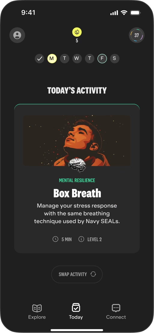
Before the pivot, Mojo was a personalised programme with daily lessons and interactive exercises helping thousands of men with their sexual issues, all served by our activity algorithm.
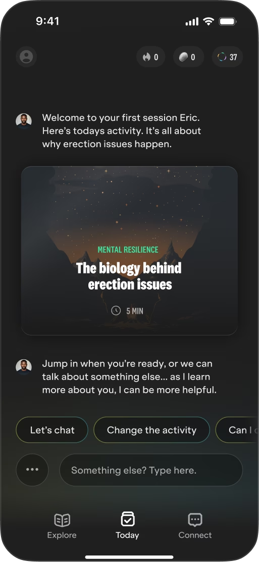
In our new chapter, the AI coach became the centre of the product, overtaking the home screen, and serving as the orchestrator of our users’ activities. It also created an exciting new opportunity for us — we could finally include talk therapy in our product and, along with lessons and exercises, deliver a complete therapeutic package to our users.
That, however, surfaced a quiet problem — an assistant that can do anything hands the user the hardest question: what am I supposed to do?
Structuring the journey
Our single focus at the time was improving trial conversion, and the numbers, compared to our previous product, were surfacing an issue. Our data analysis and research showed people were completing their first lessons, but then stalling — unsure how long the journey would last and how much was expected of them. With the app serving users up to 3 activities a day, they were asking for more structure in their own words.
“I was hoping for a more structured programme rather than being drop fed exercises in response to questions.”
— User research participant
“Structure very much needed if I’m going to renew subscription.”
— User research participant
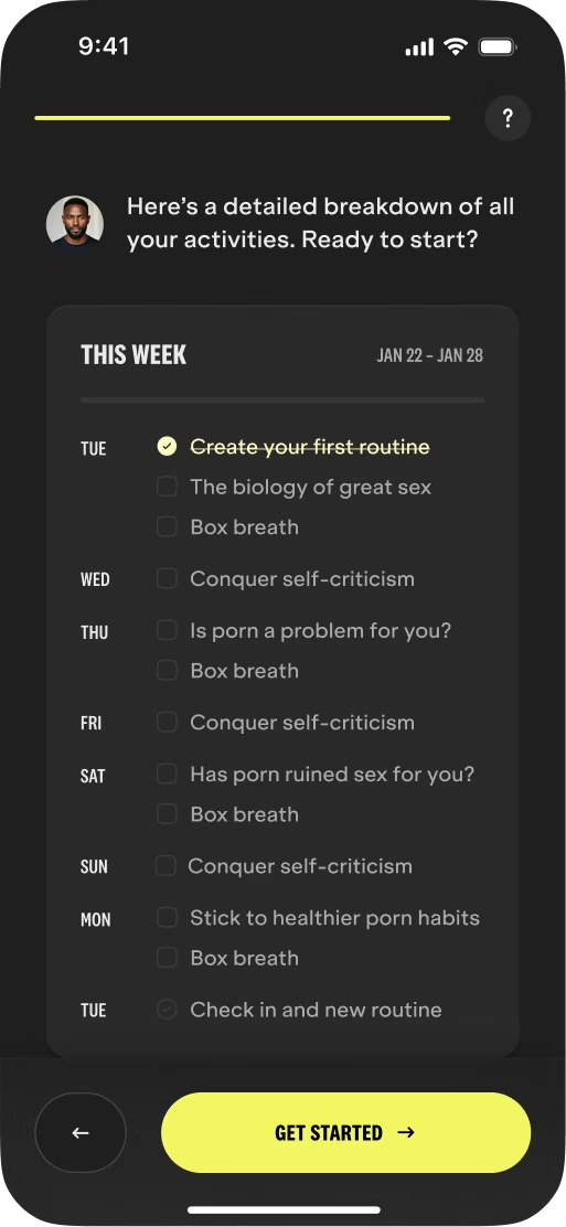
Enter: Routines
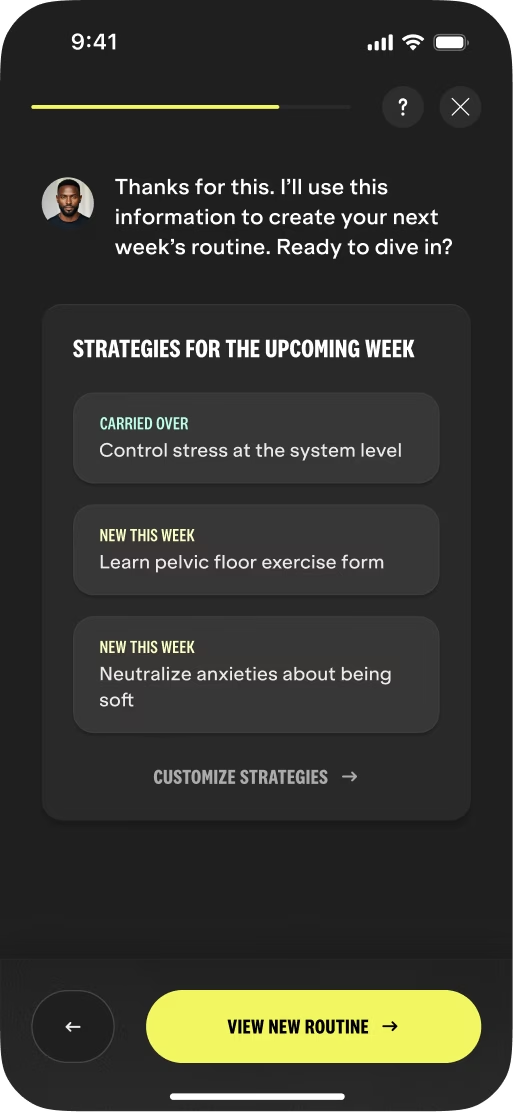
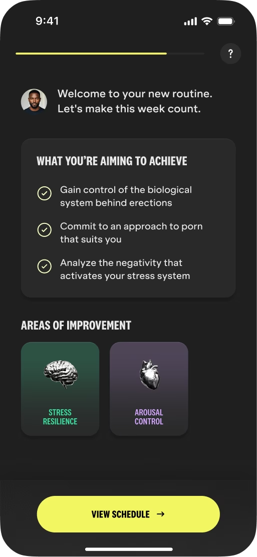
Routines answered our users’ uncertainties. The AI coach would generate a 7-day programme — with weekly strategies that decide which activities are included, and a daily breakdown that shows what to do and when.
The routines were deliberately a guide, not a strict schedule. Users could still complete activities in any order, or even skip the ones they didn’t feel were relevant. In the sensitive context of sex therapy, the goal was removing uncertainty without adding pressure.
Routines’ impact
+20.3%
Trial conversion
+17%
Day 1 retention
+33%
Activities completed
The first routine generations weren't always right — sometimes the AI included too many exercise repeats, sometimes too little focus on some strategies. In the second iteration, we added prompt-based customisation so people could steer their own plan: a feature designed around the model's failure modes.
Routines became one of users’ favourite features. Many referred back to them as instrumental to their success with the app during user research sessions.
Structuring the conversation
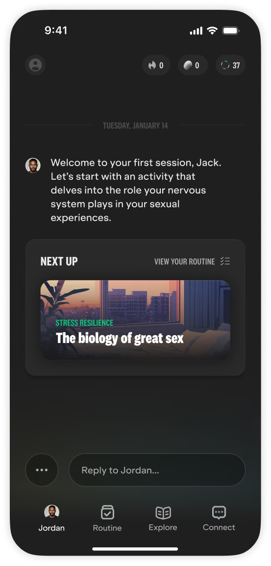
After the pivot, the chat became the home screen, aiming to put the AI first and help users establish a relationship with it. The hypothesis made sense: zero friction to start talking would help build a stronger therapeutic alliance over time.
The AI greeted users with an exercise from their routine and always asked if there was anything else on their mind, inviting users to take the conversation somewhere new.
But the numbers were once again showing an issue: users weren’t really engaging with the chat. When we approached the topic in interviews, only a few helped us see the underlying issue:
“I didn’t really understand what I could ask the coach or what’s the function, so I didn’t really use it too much.”
— User research participant
Our vision was always that the AI was responsible for setting the context and leading the therapy. But it turned out that the chat interface, promptly displayed after the app loaded, was putting a bigger burden on users than we anticipated.
Suggesting Topics
I initiated a long conversation with the team to convince them to move away from the chat home screen. Eventually we aligned behind the problem and started working on the solution.
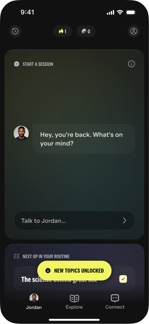
Many explorations later, we converged on a new home screen and introduced Topics: personalised conversation starters generated after every chat session.
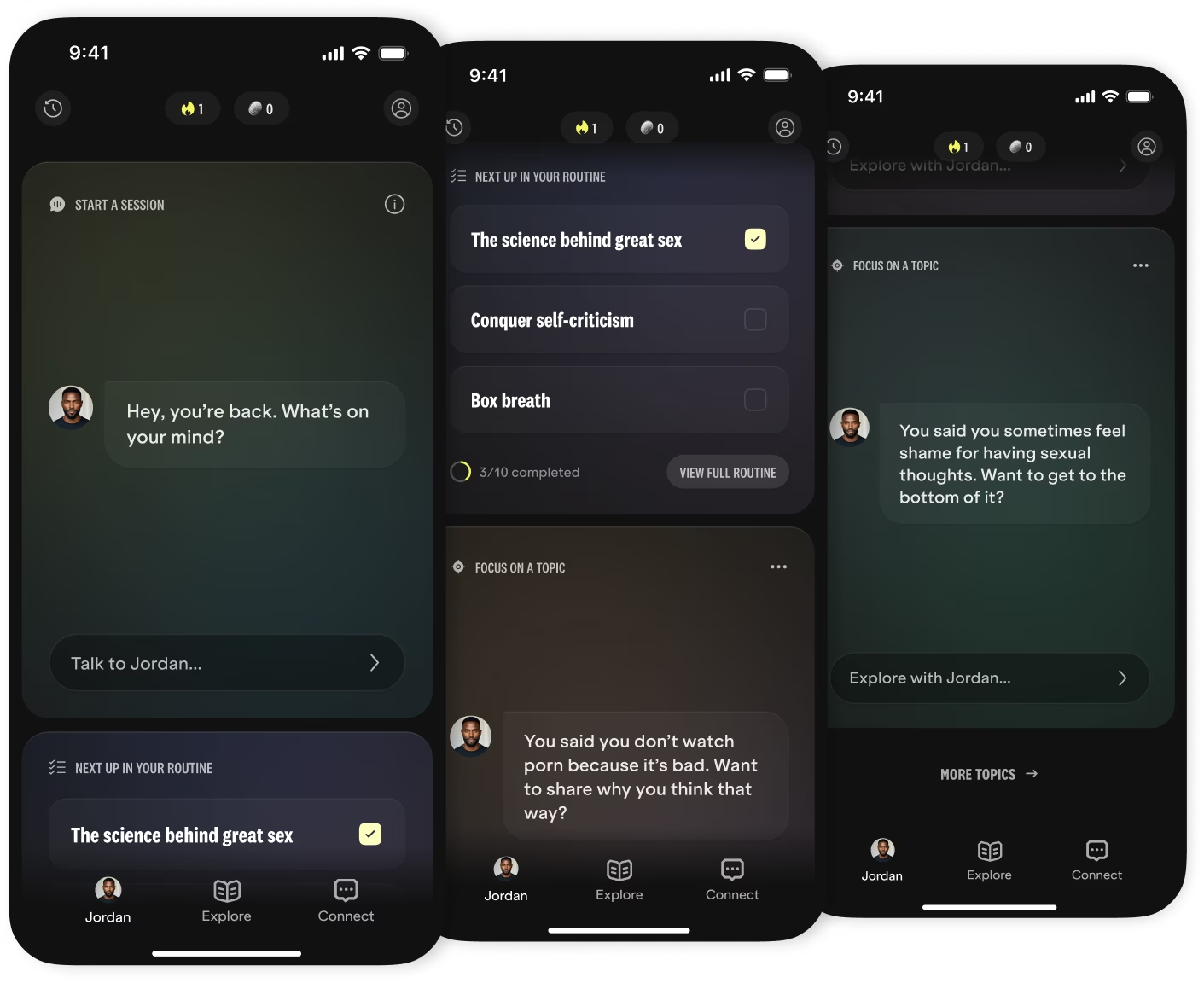
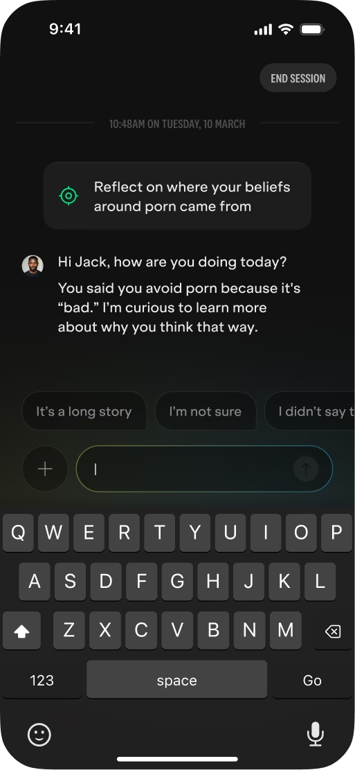
We moved the chat into a pop-up screen and established a new flow: after each conversation, the AI generates a summary, insights, and topics that help the user navigate their therapeutic journey.
Landing back on the home screen, a notification then invited the users to explore further topics — a loop that keeps the users engaged and the therapy moving.

Topics’ impact
+22.2%
Trial conversion
+31.1%
Day 1 retention
+26%
Active subscriptions
Notably, users rarely mentioned topics in research, but the data showed a positive effect. They had lowered the bar for starting conversations, and personalisation was likely a big part of it — a pattern we had seen with other experiments.
Even though the chat started as a separate track from the activities, Topics enabled Mojo’s holistic therapy model, combining conversational AI, theoretical lessons, and practical exercises.
Foundations built to transform
Working at the forefront of technology, we wanted our users to feel how cutting-edge the product they were using was. Having recently undergone a rebrand, we wanted to introduce new elements that make the app feel right next to other AI products.
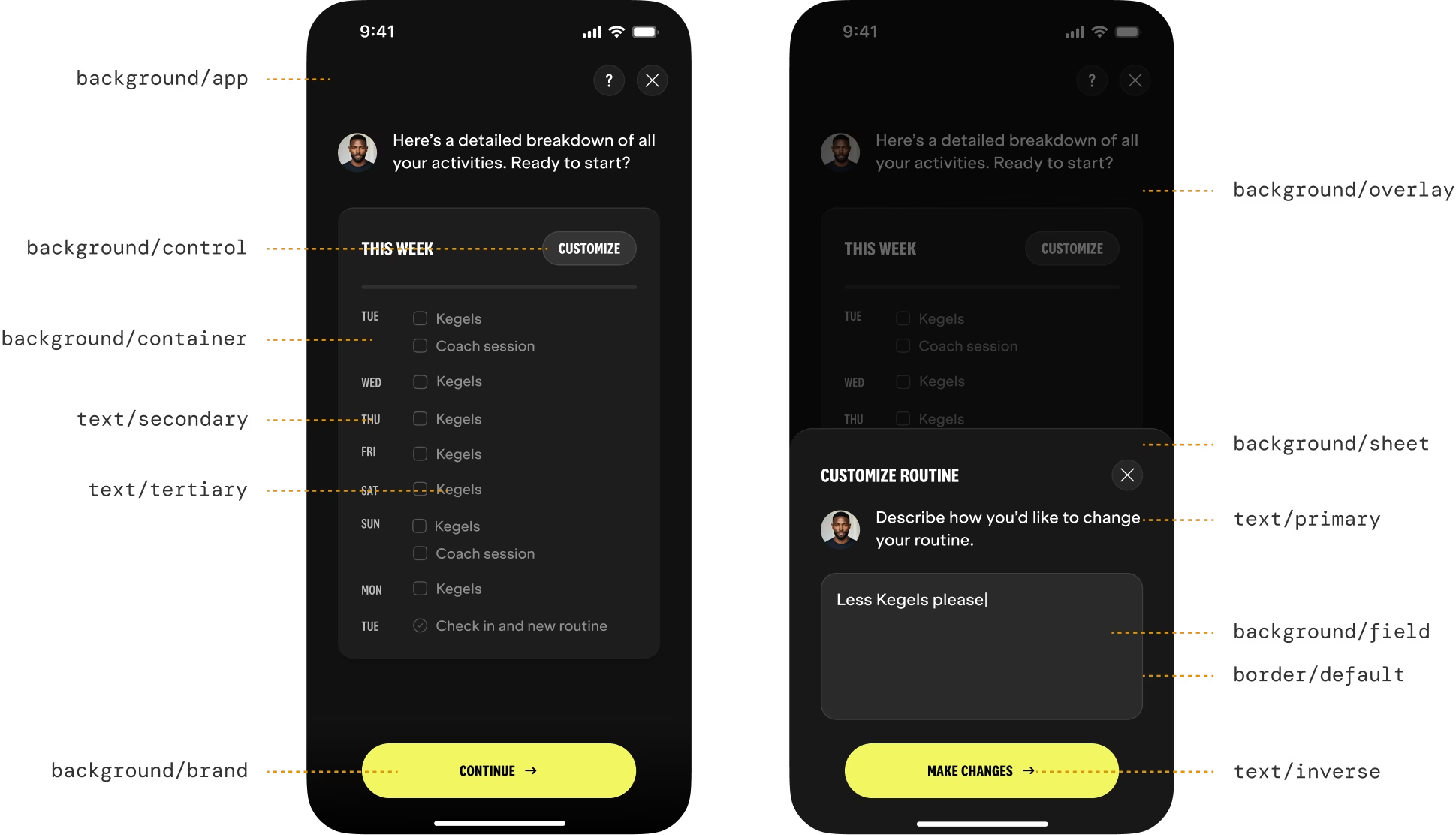
A deeper problem with our design system emerged from the visual changes we wanted to make. Working directly with our engineers, I led the consolidation of our tokens, reworked our core components and led the implementation of a unified design system across Figma and code — built for consistency and transformability.
The proof came later: when Mojo rebranded again to appeal to both male and female audiences, the system absorbed the change at a fraction of the usual effort.
Back to the structure
Generative AI has enabled exciting new user experiences by removing the constraints technology had until now. But we humans sometimes need a guide to really tap into this potential.
Twice at Mojo, the highest-leverage design work wasn't adding more capability; it was deciding where structure went back in. The boundaries of a custom interface could still outperform the infinite possibilities of a chat box.
Continue
reading
Daye Diagnostic Tampon • Web platform
The result is not the answer
Turning a subscription box into a diagnostics platform and designing the journey from a potentially alarming clinical result to actually knowing what to do about it.
Daye Period Pain Clinic • Health report
A reason to be believed
Designing a report that was conceived as a way to sell more tampons, but ended up enabling conversations that had long been dismissed.