Daye Period Pain Clinic • Health report
A reason to be believed
Designing a report that was conceived as a way to sell more tampons, but ended up enabling conversations that had long been dismissed.
Key summary
Women with period and pelvic pain can wait years for a diagnosis, and their pain is often dismissed as normal. Daye's Period & Pelvic Pain Clinic was created to assess their symptoms and return a personalised report with the potential causes of their pain, how to manage it, and what to do next. Research with Daye's community reshaped the report at almost every level — how much it presented, and how.
Years without an answer
Endometriosis affects around one in ten women and AFAB individuals in the UK, and diagnosis takes 8+ years on average. Much of that time is spent being dismissed — period pain is supposed to hurt, so a doctor hearing about severe pain often reads a low threshold instead of a symptom. Adenomyosis, PCOS, fibroids and pelvic inflammatory disease follow the same pattern. The pain is real, common, and often gets waved away.
Daye already offered prescription CBD tampons for period pain. The Clinic was a way to reach the people who needed them, through a personalised report and a prescription evaluation for the tampons, both included in the price.
The week that set the shape
I kicked off the project in January 2023 by running a week-long design sprint with the core team. That week decided what we would ask and what we would give back: the probability that a condition was causing their pain, a personalised pain-relief routine, and suggestions for evidence-based lifestyle changes. It settled the commercial model too. Users would see a free preview, then pay to unlock the rest.
After the sprint I was on my own with it — Figma prototypes, and a research round every two to three weeks. Several iterations later, the information stayed the same, but the presentation was completely transformed.
A lot to take in
Two things made this hard to design: the amount of information and what it was about. People arriving here had often been in pain for years and already knew something was wrong; the report had to be clear without being blunt about it.
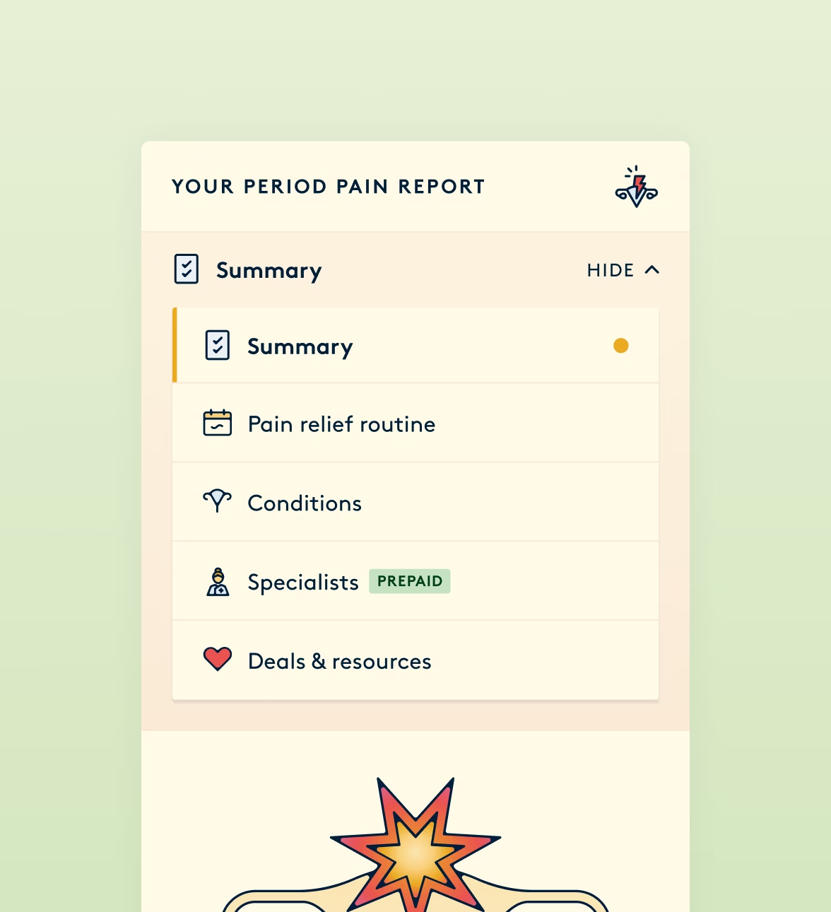
When people picture a report, they picture a document, something long that you scroll. We tested that, and it overwhelmed people. Breaking it into sections they could move between didn't help either. What worked was letting people decide how much arrived at once. The report became a set of screens, expandable components and pop-ups, each holding its detail until requested.
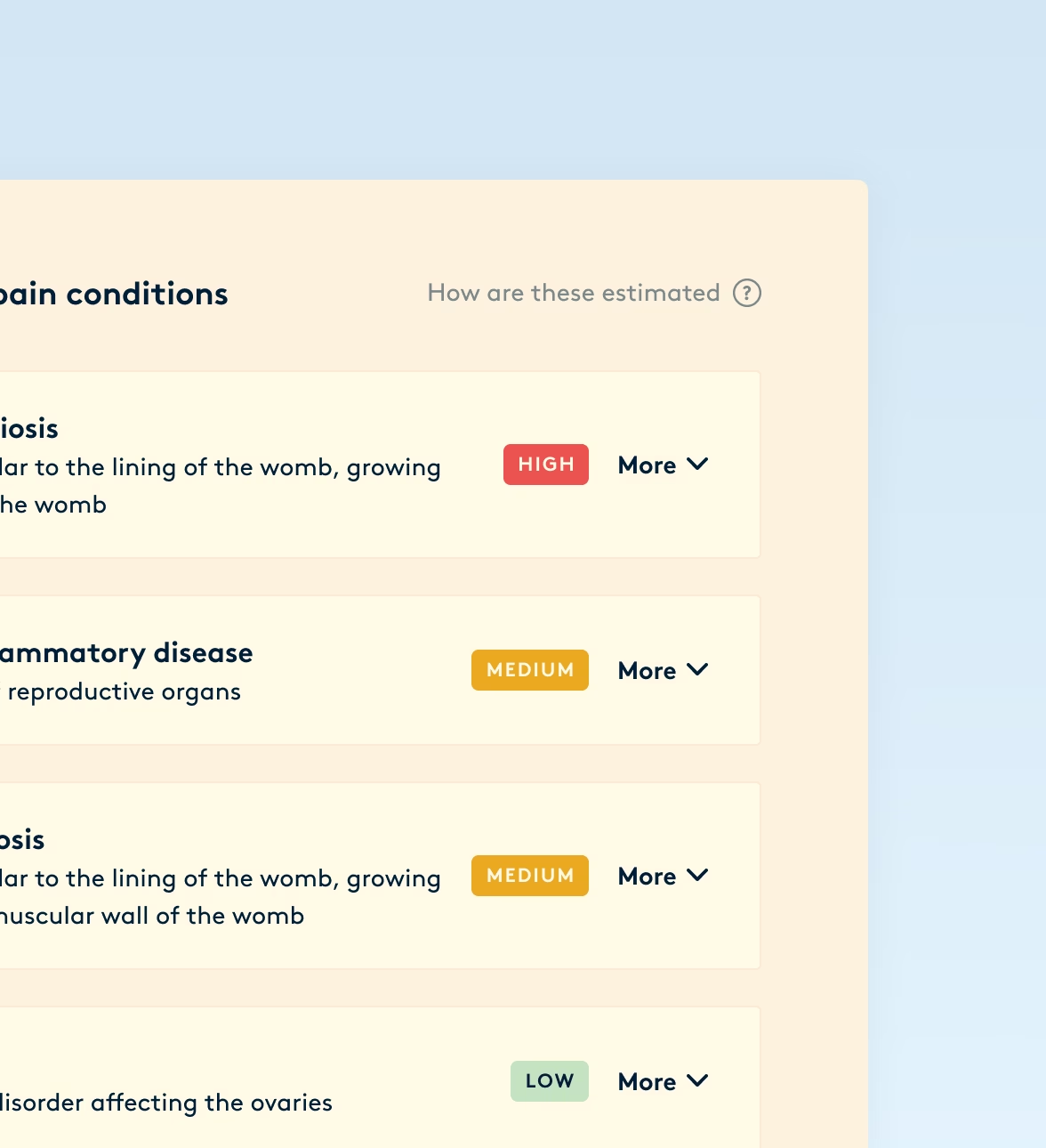
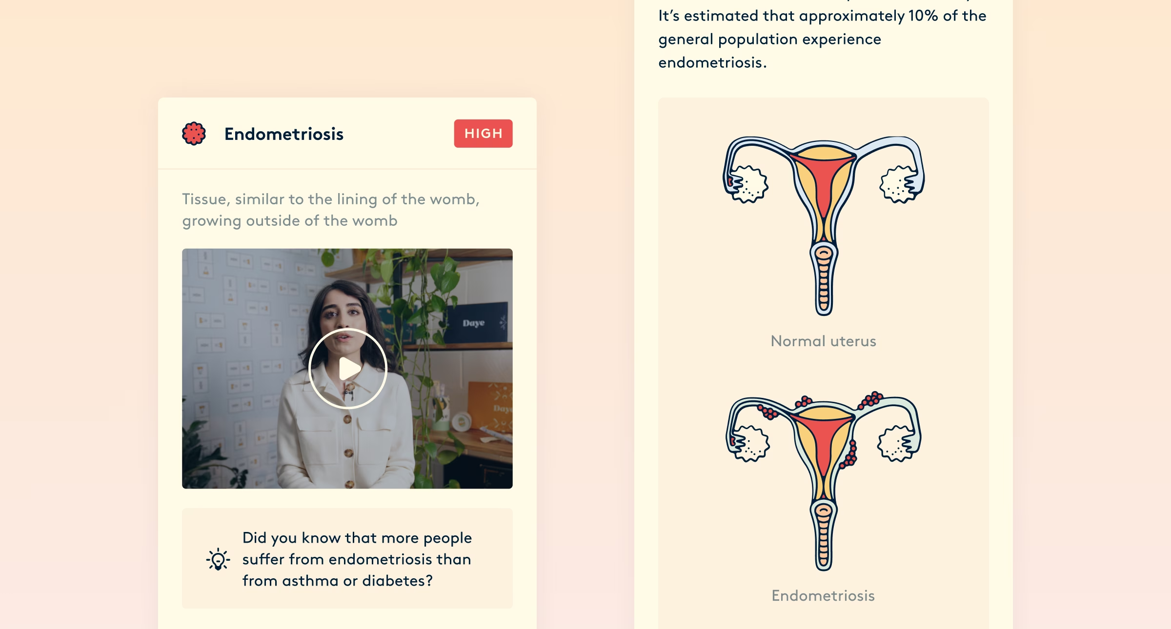
The second problem was the writing. Medical information is written for clinicians, and there was no clinician in the room. So we put one there — each condition explained on video by a doctor, a person delivering it rather than a page. Infographics carried the drier material. Recommendations linked out to sources people could check for themselves, and at checkout people could pay to speak to someone about their report.
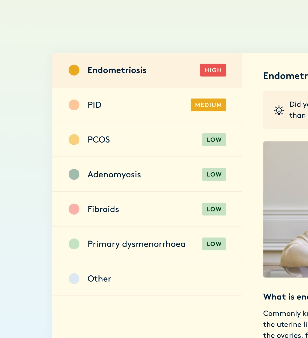
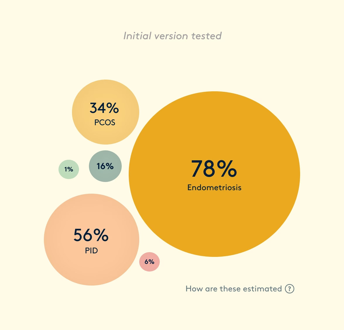
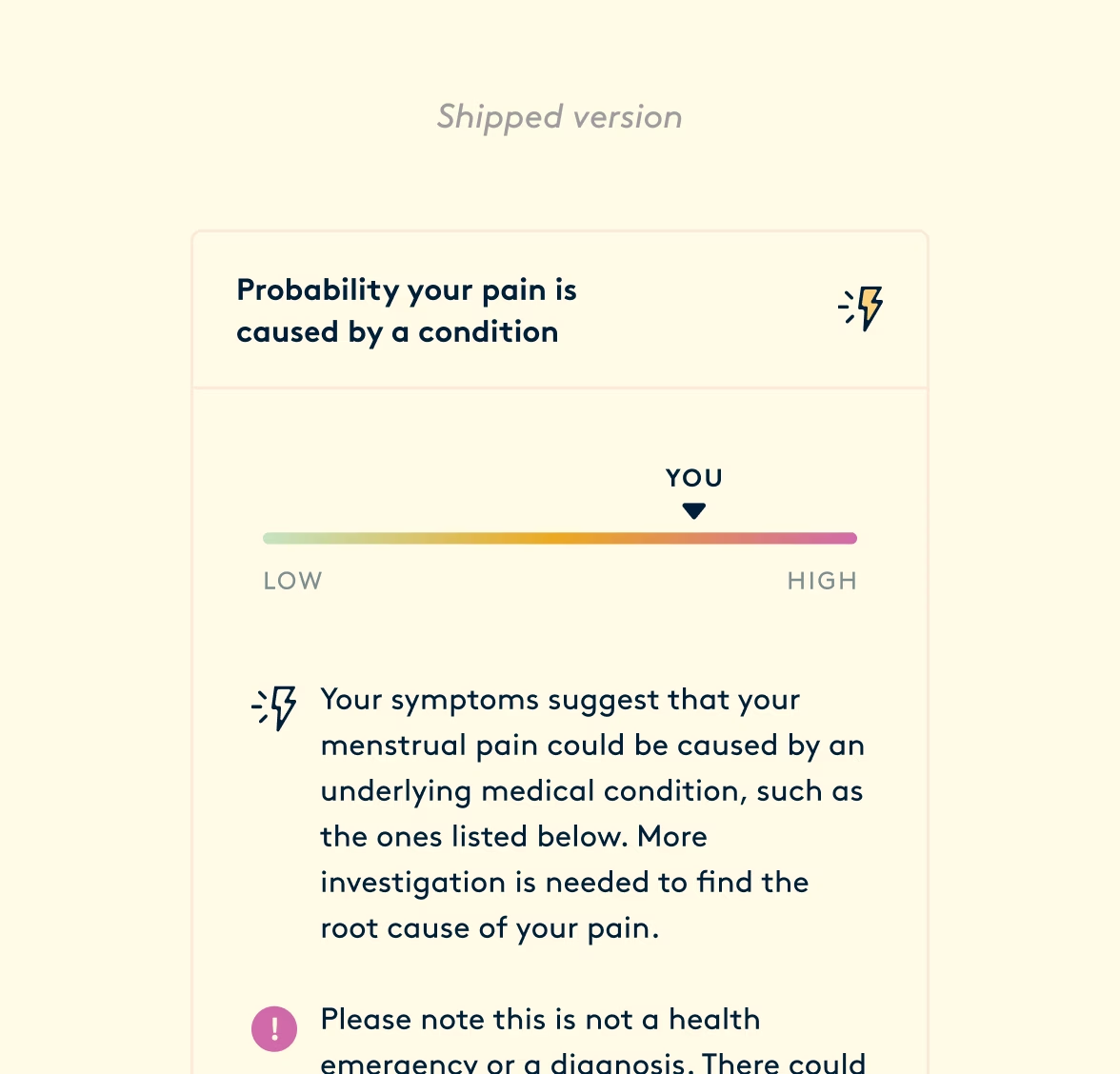
Infographics only work if they communicate unambiguously. Each condition carried a percentage, and participants shown a high number next to endometriosis understood that they probably had endometriosis, even though the figure only counted how many symptoms matched a guideline. What replaced it was a gradient — showing a single reading across the whole result and easing people into their report instead of overwhelming them.
Making it worth the unlock
The free preview originally sat around the condition probabilities — the most compelling thing in the report, but also the most alarming. We chose not to lead with it. People came to this report after years of being told their pain was nothing; naming a condition and charging for the explanation was not how we wanted to greet them.
The conversion had to rest on depth instead, which left the harder problem of making that depth explicit. A list of what you get is only a claim. It asks people to take our word for how much sits behind the paywall before we'd earned their trust.
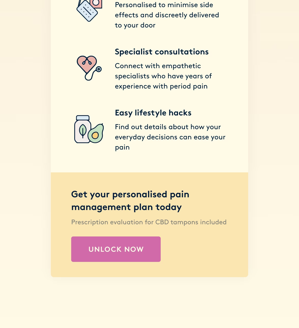
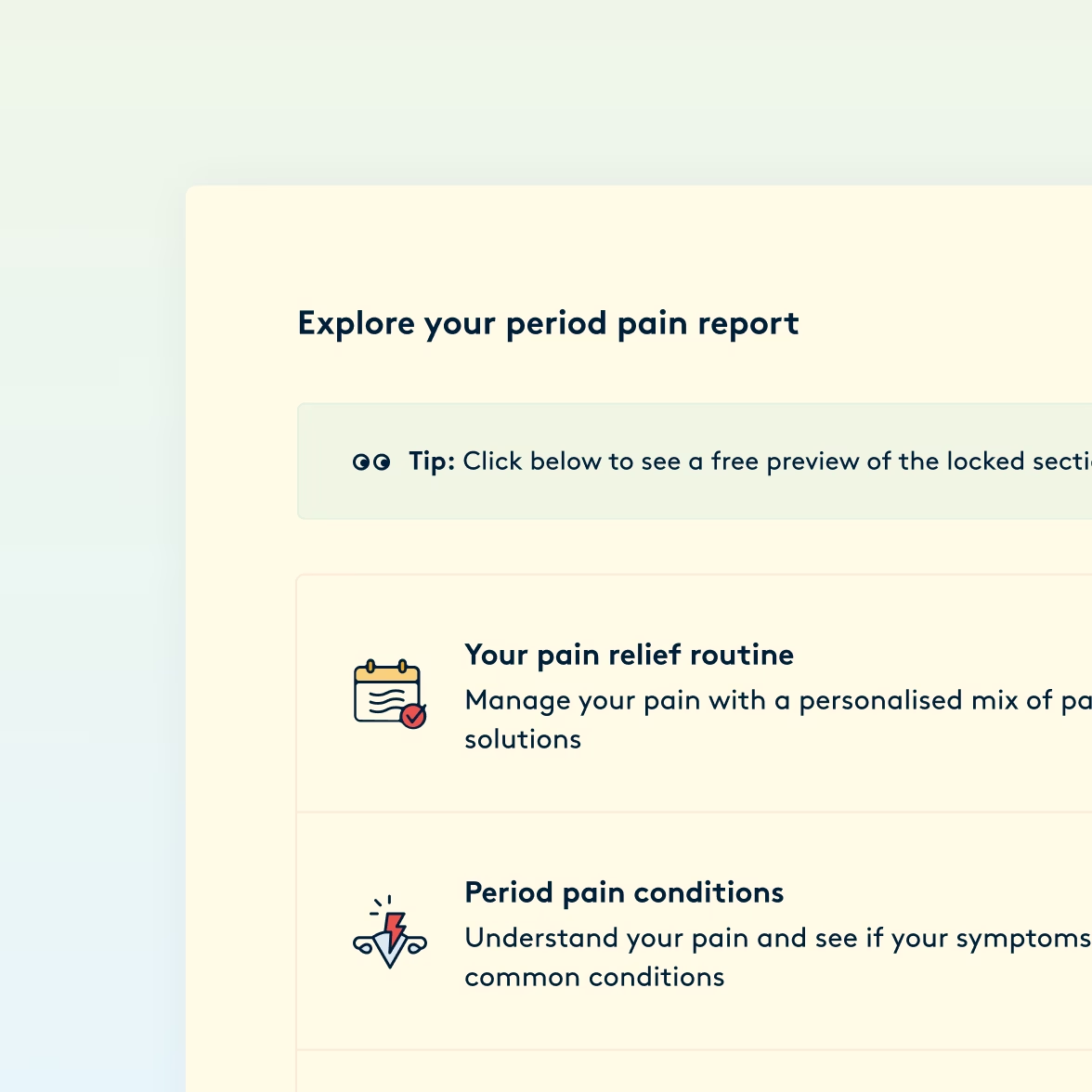
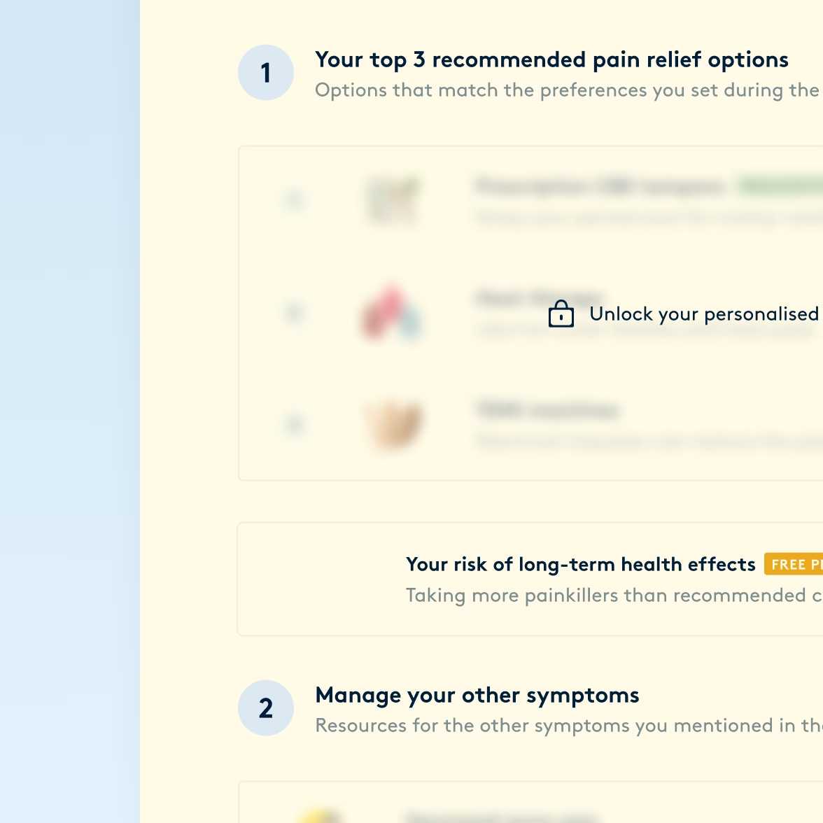
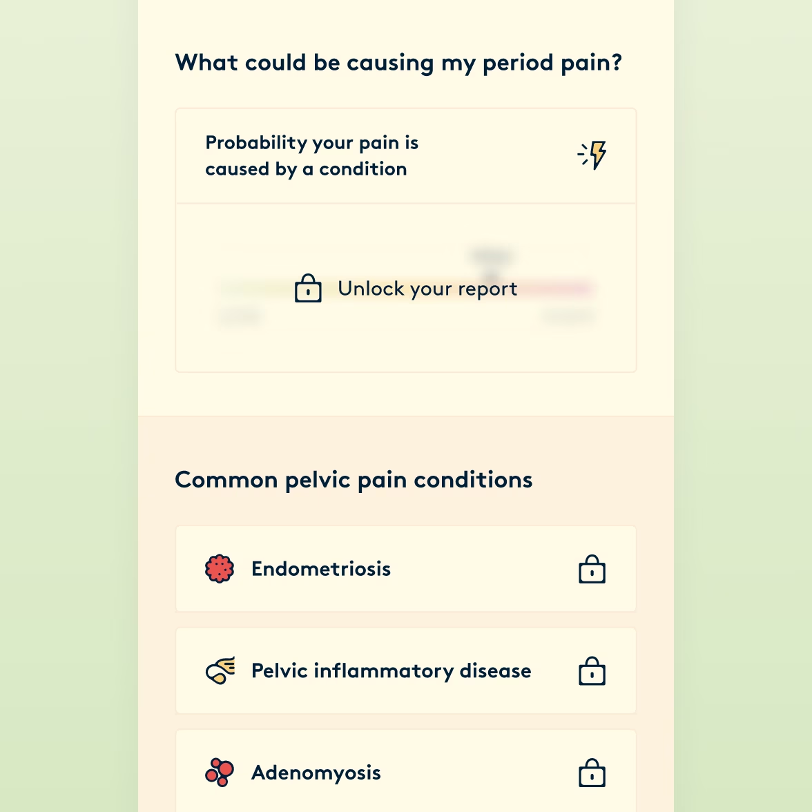
So we showed the depth instead. Every locked section was named and described, and the real recommendations appeared blurred. There was nothing behind the paywall that wasn't already in front of them, just out of focus.
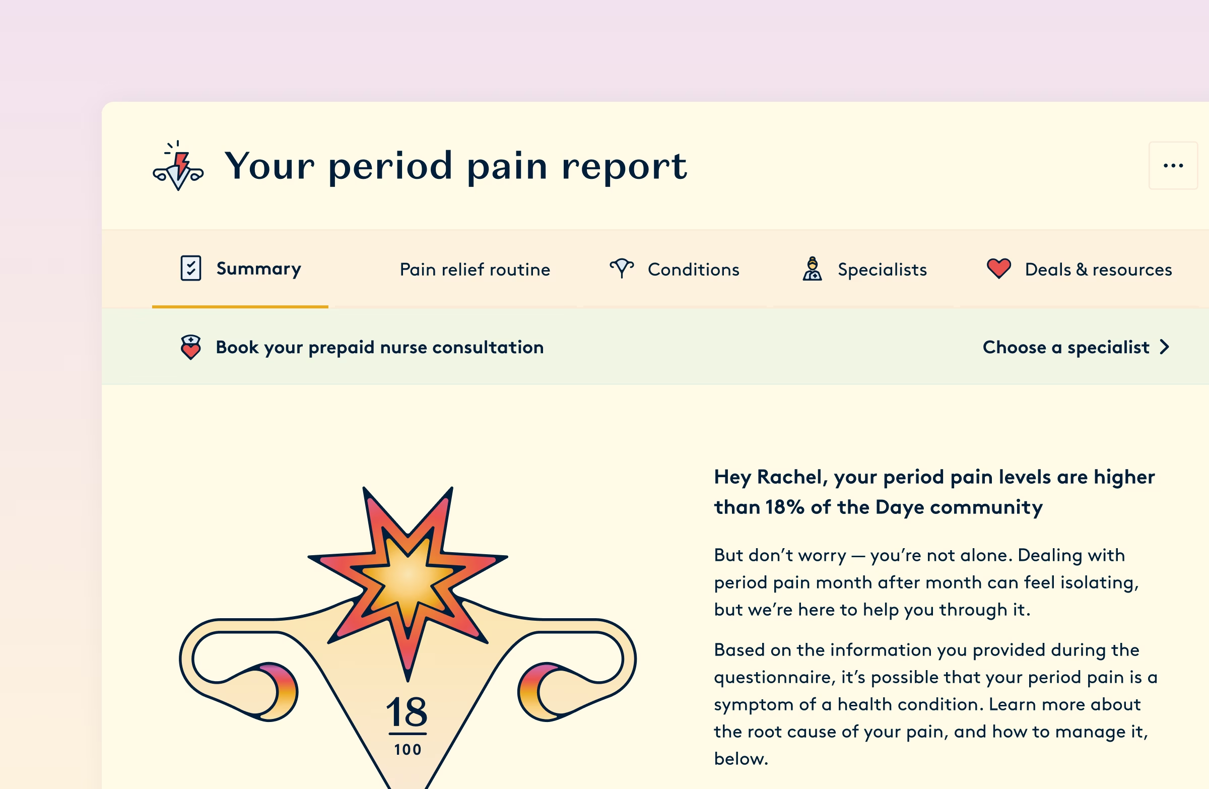
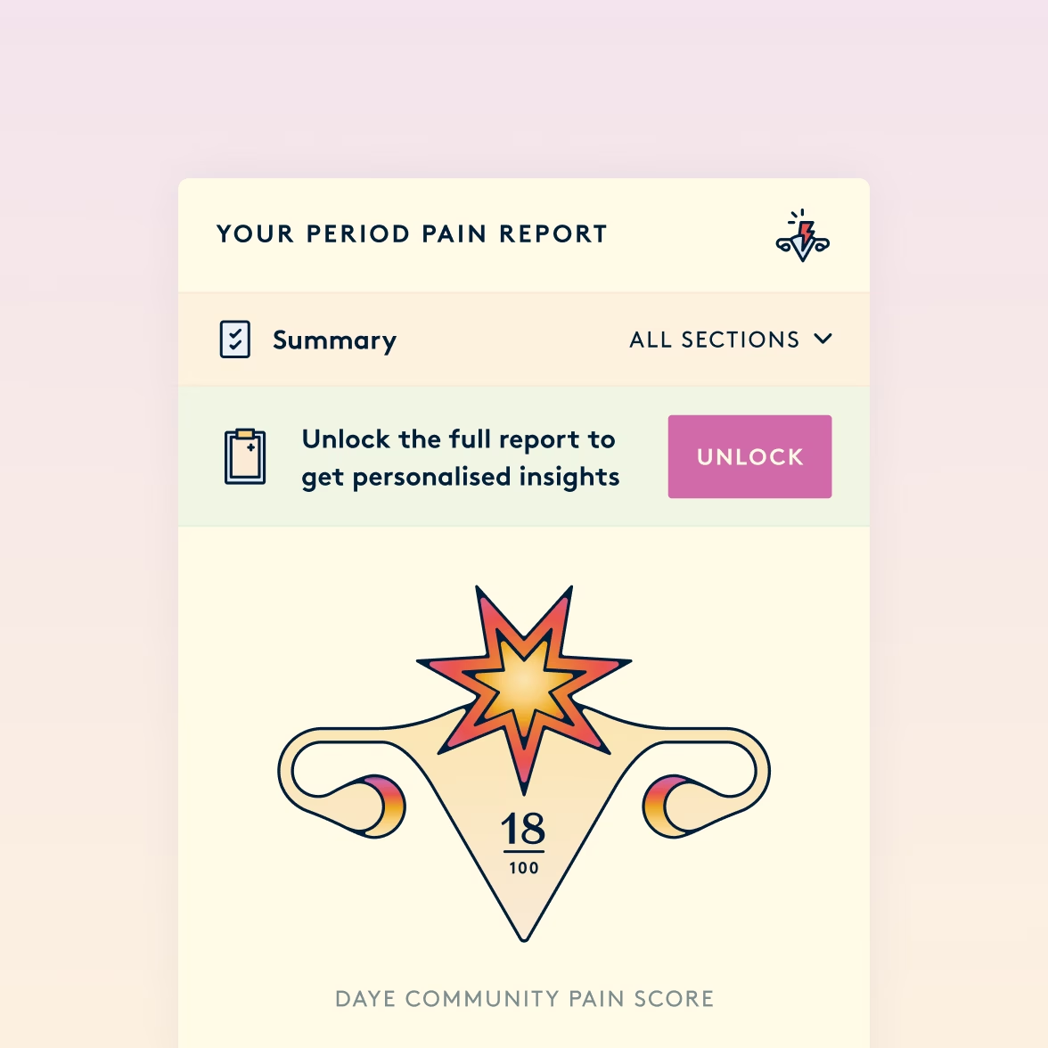
What people saw first stayed free: their pain measured against everyone else who had taken the questionnaire. It told people their pain was real before it told them anything else.
A clear path forward
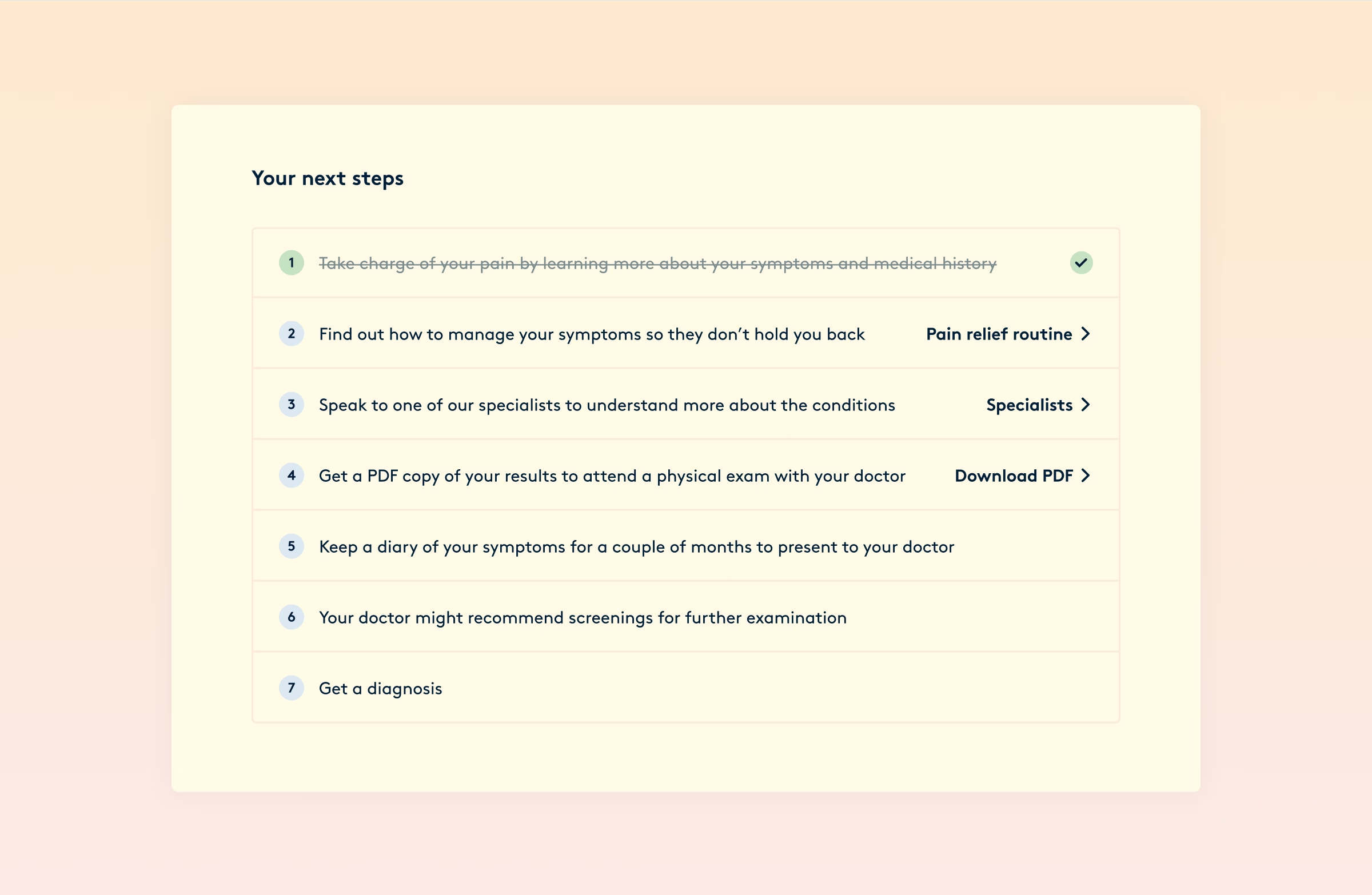
The report ends with the steps towards a diagnosis.
The first is already struck through, because the user took it by filling in the questionnaire. The next few sit within Daye's remit and are easy to reach from here, including the PDF they can take to an appointment as evidence for their situation. After that, nothing on the list has a Daye product attached: the remaining steps belong to a doctor.
What the Clinic ended up offering people wasn't an answer. It was a plan, and a reason for their pain to be taken seriously at their next appointment.
Continue
reading

Next-DC • Campaign sites
Interactive campaigns
A staredown with Andrea Pirlo, a fashion brand you bought with knowledge, and the hunt for a teenager who didn’t exist.
Mojo • Mobile app
Structure that converts
Putting structure back into the world’s first AI sex and relationship therapist with two new features, lifting trial conversion more than 20% each time.