Daye Diagnostic Tampon • Web platform
The result is not the answer
Turning a subscription box into a diagnostics platform and designing the journey from a potentially alarming clinical result to actually knowing what to do about it.
Key summary
Daye's Diagnostic Tampon lets women collect a clinical sample and get their results without leaving home. Over seven months I designed the platform around it — the whole path from ordering a kit, through reading a result, to getting aftercare. The result screen was the part everyone pictured first, but it was only the beginning of the experience for our users. Getting treatment and aftercare turned out to matter most, and that’s the first thing we iterated on after launch. The product has since expanded to cover more test types and new markets, and is now the company's main focus.
Moving into diagnostics
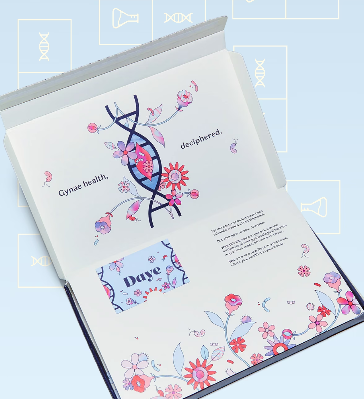
Daye is a gynaecological health startup that was created to redesign a device women and AFAB individuals use every month: the menstrual tampon. The company set out to improve everything about it: its safety, sustainability, even included an optional CBD coating. They were sold as a subscription: you built a personalised box, set a delivery frequency around your cycle, and managed the whole thing from your account. When I joined the company, that was the first project I worked on, with many iterations to follow.
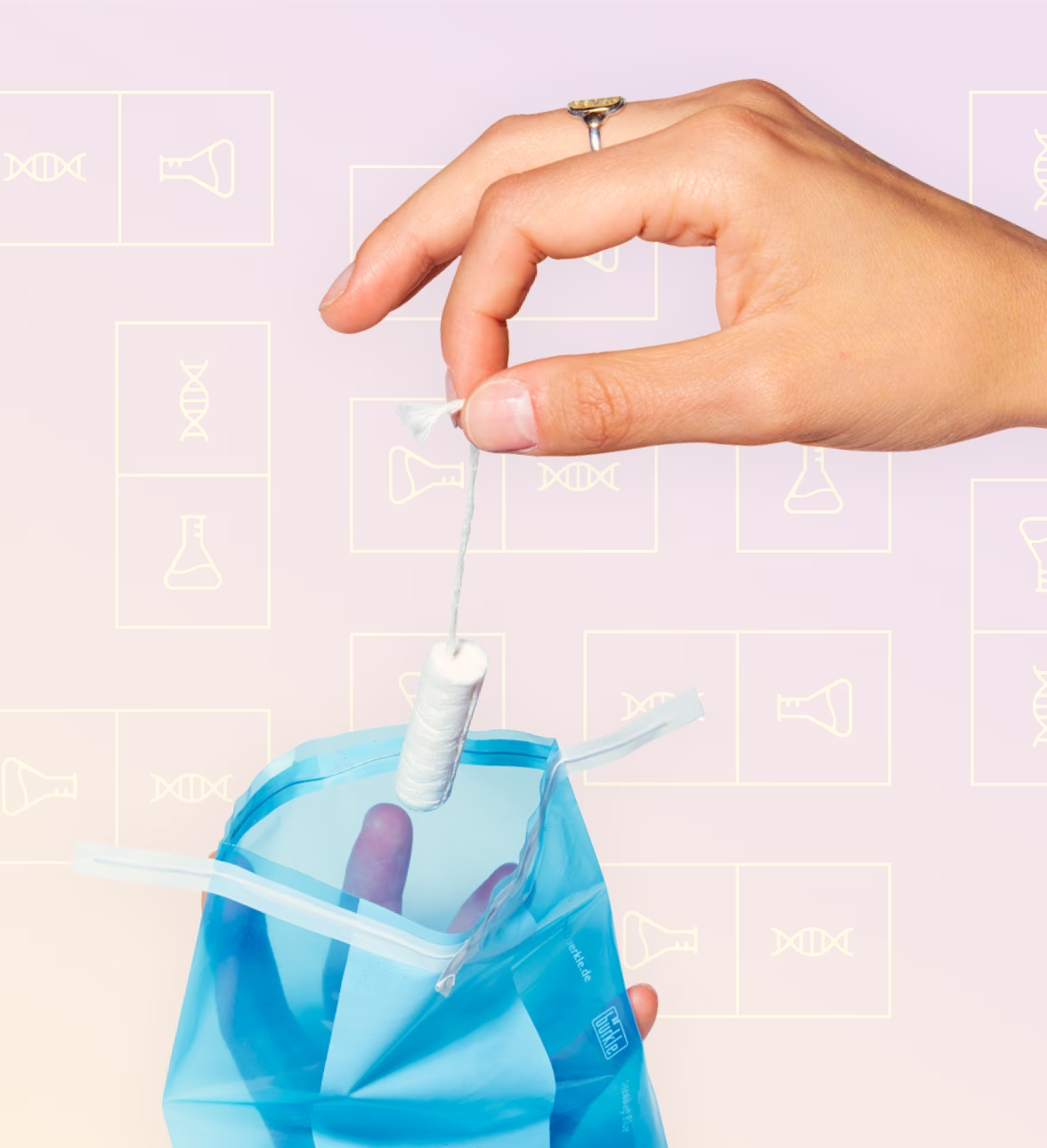
In 2022 we moved on to the real ambition: that same tampon could also collect a vaginal sample — insert it, seal it, post it back to a lab. Scientific research proved it works as well as, if not better than, a swab, but no one had commercialised it yet. We planned to launch with a single screen for the vaginal microbiome: the microorganisms behind infections like thrush and bacterial vaginosis (BV). Further certification would let it screen for sexually transmitted infections and HPV, the virus behind one of the most preventable cancers.
The clinical case is simple: regular screening depends on people turning up to appointments that are uncomfortable, hard to schedule, and easy to skip. Patient adherence suffers, and so do outcomes. Moving sample collection to people’s homes removes those barriers.
The design case came down to one thing. Someone, sitting alone at home, was going to get potentially difficult news, with no one else in the room to interpret it or support them.
Connecting the experience
While the rest of the team was busy with the physical kit and the lab integration, I designed the digital experience end to end: the shop, how people activate their kits, how they receive their results, and how they access aftercare.
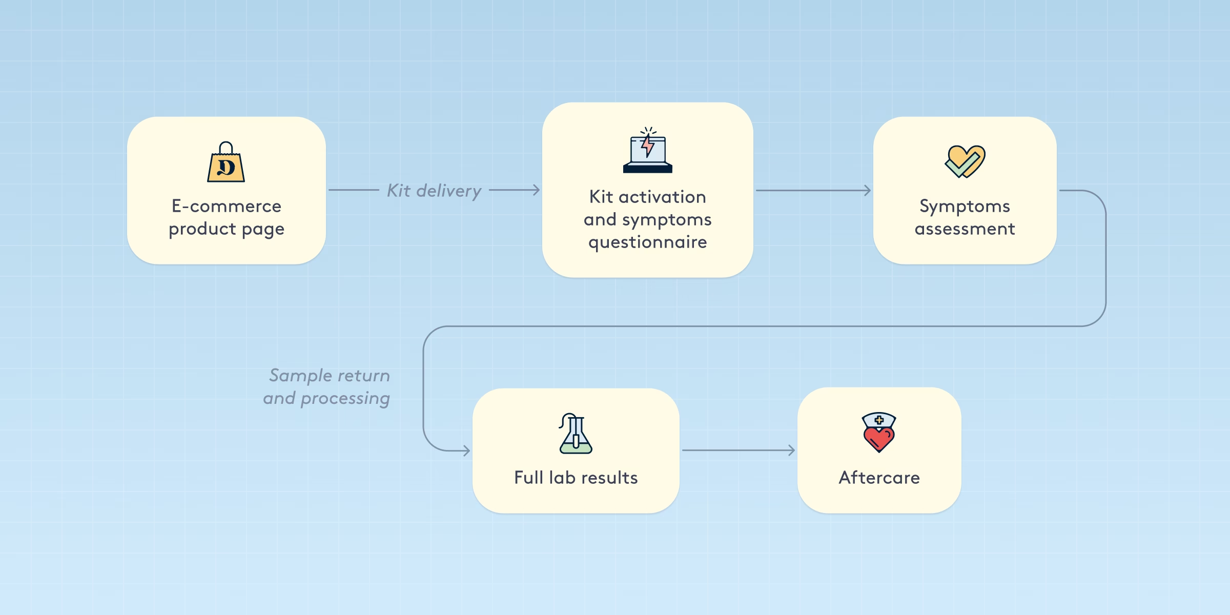
Four decisions shaped the overall design of the experience:
Ask while the stakes are low
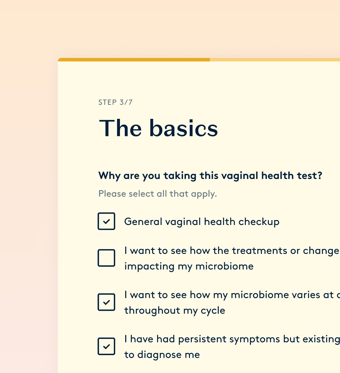
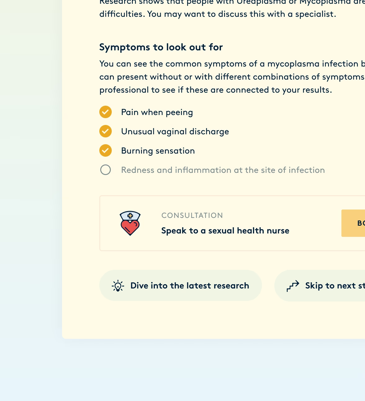
A positive BV sample doesn't qualify anyone for treatment on its own — they have to report symptoms too. We collected those symptoms while people were activating their kit, not after they got their results, so eligibility was settled before they got any potentially upsetting news.
Disclose progressively, as information arrives
Once someone filled in their symptoms, they got a first recommendation — see a physician if anything in their responses required attention. When the lab was ready, the recommendations were updated with the actual results, and people could go as deep as they wanted from there.
Always give people a next step
Users always saw their raw results alongside a plain-language explanation, approved by our medical board. Positive results opened aftercare routes: a treatment prescription or a consultation with an empathetic nurse, while negative ones offered preventative care. Every result opened onto something a person could do next.
Build for the tests we knew were coming
STI and HPV testing were on our roadmap, so the flow was built around what people want to do with the result, rather than specifically around what the vaginal microbiome test measured.
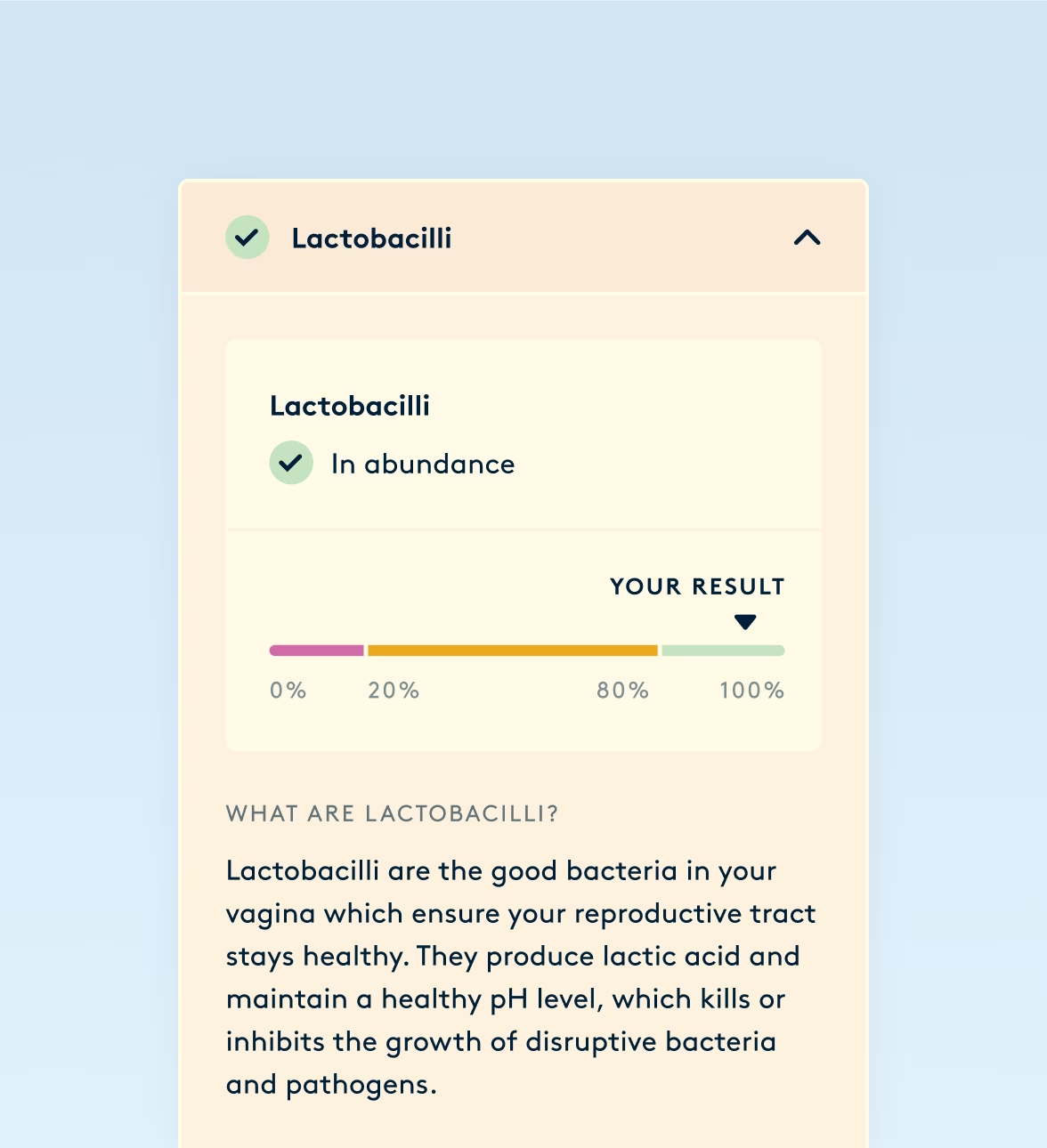
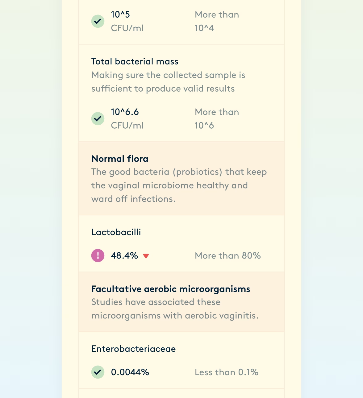
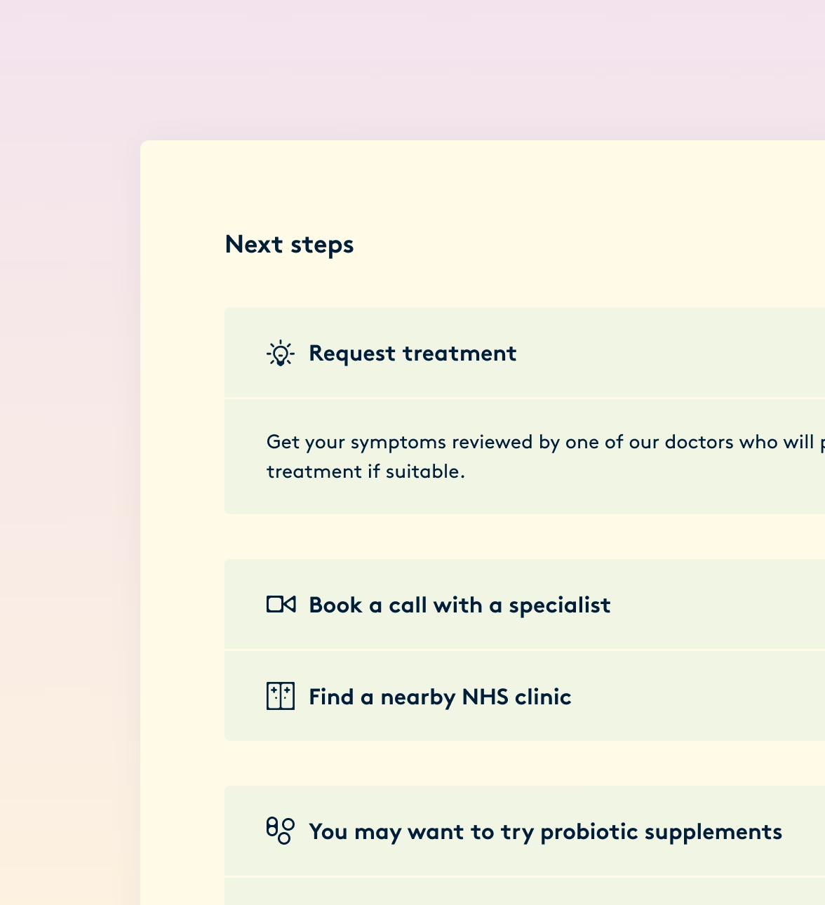
Designing for the next step
We shipped, and one signal came back unambiguous. The number of kits sold was growing, but the prescriptions and nurse consultations were rarely bought.
The problem wasn't technical. It was the experience. User research helped us realise that the screening platform treated the result as a destination — the thing the product existed to deliver. For our users, however, it was a doorway: everything that mattered was on the other side of it.
We were treating aftercare as an upsell — it needed to be part of the main experience instead.
Refocusing the report
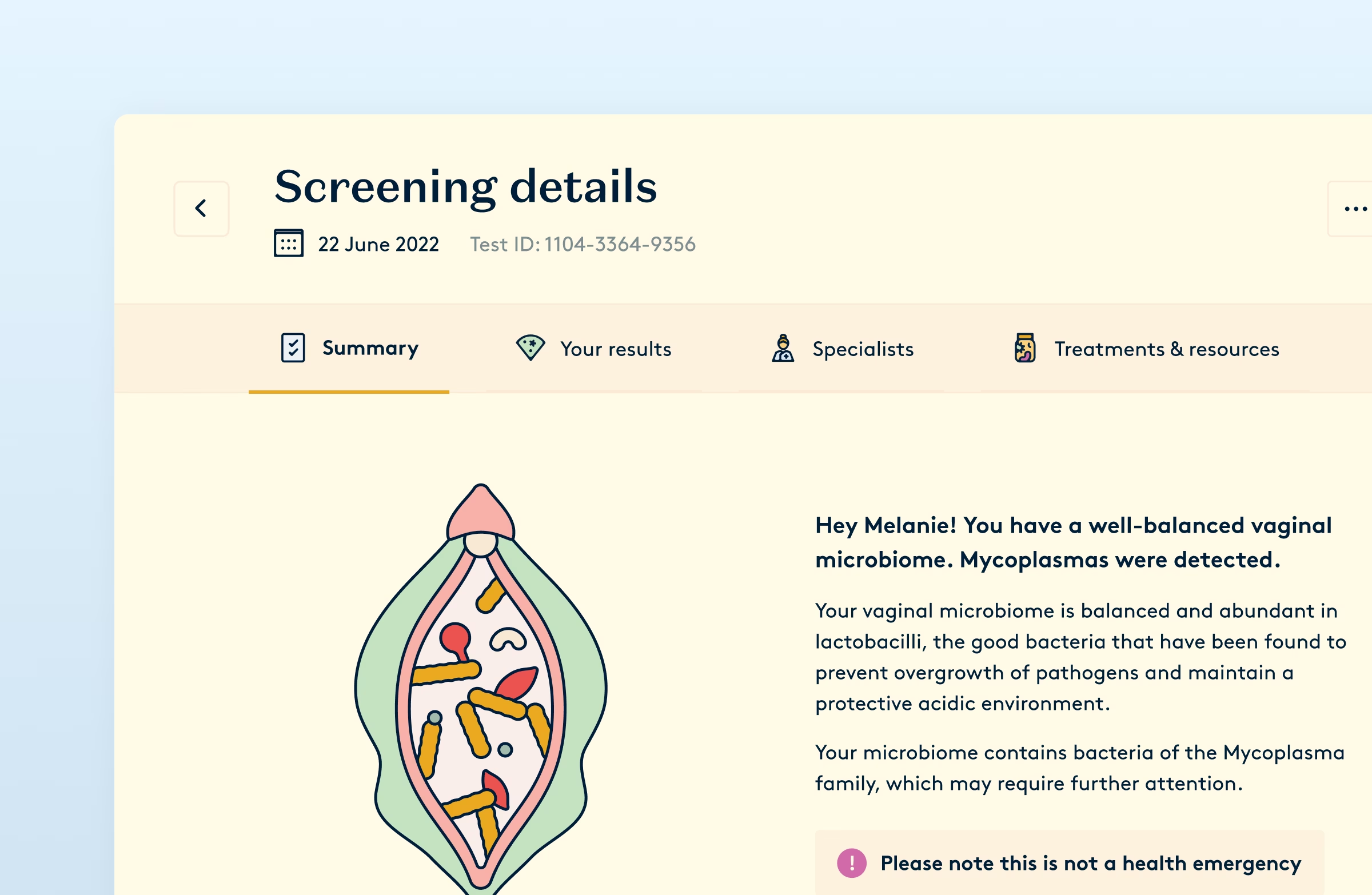
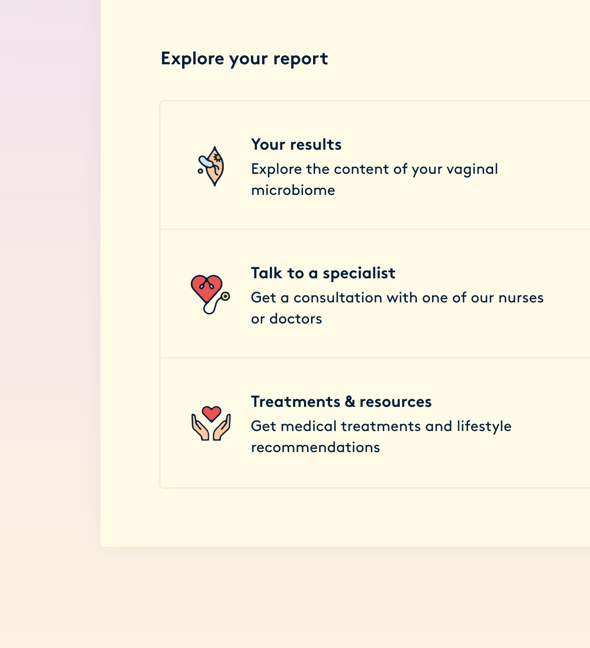
The second version made the result easier to take in, and the next step harder to miss.
The report broke into sections, so a result could be absorbed in stages rather than delivered whole. The nurse consultation moved from an option to an invitation — the most human next step available, offered ahead of the transactional prescription request.
The change went beyond these screens. Aftercare came out of the flow and into the product page: today it's an add-on you can buy at checkout, before your kit even arrives.
What lasted
Almost 4 years later, the platform is still running. While there were new features added and visual changes made, the architecture remains structurally unchanged. Because the flow was built around what people do with a result rather than what the first test measured, the team added the new STI and HPV screens without rebuilding it.
That expansion took the Diagnostic Tampon into the NHS Innovation Accelerator, a three-year fellowship for innovations aligned to NHS priorities — among them NHS England's target to eliminate cervical cancer by 2040.
In health products the instinct is to design towards the moment of truth — the number or diagnosis — because that's what everything has been building towards. But patients don't want a result. They want to know what to do about it.
Continue
reading
Daye Period Pain Clinic • Health report
A reason to be believed
Designing a report that was conceived as a way to sell more tampons, but ended up enabling conversations that had long been dismissed.
Next-DC • Campaign sites
Interactive campaigns
A staredown with Andrea Pirlo, a fashion brand you bought with knowledge, and the hunt for a teenager who didn’t exist.